Background

As part of Designlab’s UX Academy, I created a responsive website for Kaus, a fictional insurance company.

For the past 30+ years, the company has been working through regional agents rather than selling insurance directly to customers. To keep up with competitors, Kaus needed to attract a younger, digital-native audience.

I started by researching the insurance industry and the needs of its target users and conducted user interviews. I developed the information architecture, analyzed potential user flows, and finally created branding, user interface design, and ultimately a responsive website that addressed the pain points I identified in my research and delighted the user.  

Design Goals & Objectives

1. Give a new brand identity to attract younger customers
2. Offer seamless interactive website to make insurance easy and a good experience.
3. Build an online presence that offers a unique product that is different than their competitors.

Research

Goals


1. Understand how young people view brands that offer insurance?
2. Determine how other insurance companies present their product to consumers?
3. Understand how consumers buy insurance online?
4. Determine the problems consumers face when purchasing insurance?

Competitive Analysis

What does the competition do? For competitive analysis, I sought out some the most popular insurance companies according to several insurance publications.

Strengths

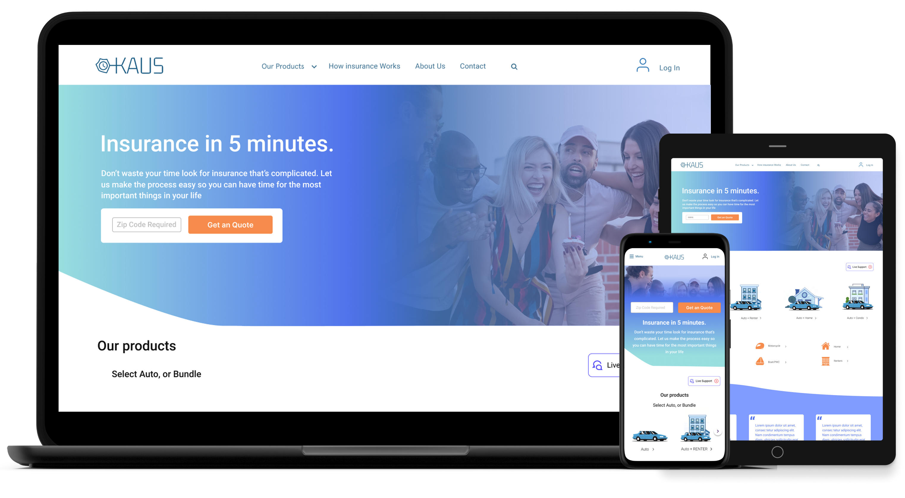
Simple landing page.

Variety range if insurance options, including a discount program.

User flow to find a local agents all over the united states is

Very easy steps to get a quote

Strong brand recognition because of “Jake from State farm.

Interface has clear information architecture both on mobile and desktop

A lot of information so customers
Award winning application for both iOS and Android

Strengths

Organizesd  bunddle mutiple policies choices.

Allstate has a well-functioning and interactive website that draws a large number of internet traffic and sales.

Good transperecny with their customers.

Strong brand and Product services are diversified

Strengths

Very modern website with aesthetically pleasing illustrations.

Reviews on the landing page to create trustability.

Consistent UI
Uses the latest technology to leverage growth.

Friendly story telling

Can get insurance quote straight from the website

Weaknesses

Weaknesses

Weaknesses

Concentrated only in the United States

Options to get online quotes is not available

Too much white space on the landing page.

No chat box or live chat

No bundles offered

Very young company so not everyone knows about them.

Service available only in selected some areas.

No chat box  or live chat

Outdated UI
Insurance bundles not customizable
To get a quote you have to call.

Not an easy online experience
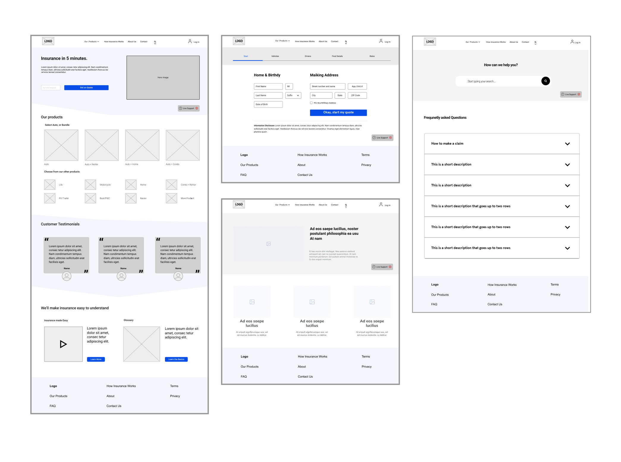
Telling the Story

Based on the information gleaned from the user survey I assembled the persona of David, Progressive user. I then further empathy for David by creating a User Flow and Task Flow. Those tools helped to design the Website Map, a blue print for the the design phase.David

Site Map

Ideation

I began the ideation phase by deciding to create a responsive desktop site instead of a mobile app. Three reasons support this decision:
  • Since KAUS is already late to the e-commerce landscape, it is better to first shape an online presence
  • Based on research findings, most insurance shopping (or quoting activities) takes place on websites. This is because the price and coverage comparisons are easier to complete on a computer
  • The desktop site will also benefit existing customers of KAUS, who are much older than the new target segment  

Wireframes

Based on the information gleaned from the user survey I assembled the persona of David, Progressive user. I then further empathy for David by creating a User Flow and Task Flow. Those tools helped to design the Website Map, a blue print for the the design phase.David

Branding

I chose my primary logo by the way the timer and shield interacted with the font. The blue makes people trust the brand and identity as well.David

UI Screens

Next Steps

Make Adjustments

Make design and wording adjustments according to user feedback. This includes missing options, features, photos, information, errors, and suggestions.

High Fidelity Prototype

Include more options in invision app to test. This includes showing hover effect on buttons and images.

Test

With the new changes, do more usability testing and gather feedback to improve the product.